Beyond the logo visual brand system
Related Company: Oxygen Communications Ltd

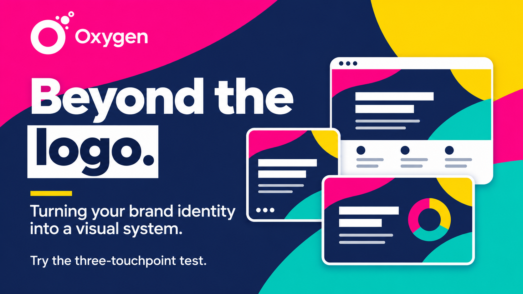
Beyond the logo: turning your brand identity into a visual system

17th Nov 2026

You’ve got the logo, the colours, the typography, the imagery and the graphic devices. So… now what?

As Oxygen highlights, having all the ingredients of a visual identity doesn’t automatically mean you have a visual system. The difference lies in how those ingredients interact.

The relationships make the difference

Perhaps your boldest colour appears only at key moments. Your photography might always sit within a particular graphic device, while your type hierarchy stays consistent even when the layouts change completely.

Those relationships help make an identity recognisable without making every piece of communication look identical. They give the people creating your materials a framework that supports both consistency and flexibility.

Try Oxygen’s three-touchpoint test

Make three completely different things:

  • A social media post.
  • A presentation slide.
  • A webpage.

Place them side by side. Do they feel like siblings—or complete strangers?

Look beyond whether they use the same logo and colours. Is there a familiar type hierarchy? Does the imagery follow a consistent approach? Do the graphic devices help connect the pieces?

Each format has a different job, but all three should feel as though they belong to the same organisation.

A system that works beyond the brand presentation

A useful visual system gives your team room to adapt. A social post, a presentation and a webpage need different layouts, but the relationships between their elements can keep them recognisably yours.

Oxygen’s next instalment explores what happens when someone asks you to create something your beautiful brand presentation never accounted for.

Try the three-touchpoint test and share it with whoever is responsible for keeping your brand communications in the same family.

With thanks to Oxygen for sharing these insights.

Back to news

Beyond the logo: turning your brand identity into a visual system

17th Nov 2026
Beyond the logo visual brand system
Related Company: Oxygen Communications Ltd

You’ve got the logo, the colours, the typography, the imagery and the graphic devices. So… now what?

As Oxygen highlights, having all the ingredients of a visual identity doesn’t automatically mean you have a visual system. The difference lies in how those ingredients interact.

The relationships make the difference

Perhaps your boldest colour appears only at key moments. Your photography might always sit within a particular graphic device, while your type hierarchy stays consistent even when the layouts change completely.

Those relationships help make an identity recognisable without making every piece of communication look identical. They give the people creating your materials a framework that supports both consistency and flexibility.

Try Oxygen’s three-touchpoint test

Make three completely different things:

  • A social media post.
  • A presentation slide.
  • A webpage.

Place them side by side. Do they feel like siblings—or complete strangers?

Look beyond whether they use the same logo and colours. Is there a familiar type hierarchy? Does the imagery follow a consistent approach? Do the graphic devices help connect the pieces?

Each format has a different job, but all three should feel as though they belong to the same organisation.

A system that works beyond the brand presentation

A useful visual system gives your team room to adapt. A social post, a presentation and a webpage need different layouts, but the relationships between their elements can keep them recognisably yours.

Oxygen’s next instalment explores what happens when someone asks you to create something your beautiful brand presentation never accounted for.

Try the three-touchpoint test and share it with whoever is responsible for keeping your brand communications in the same family.

With thanks to Oxygen for sharing these insights.

Back to news