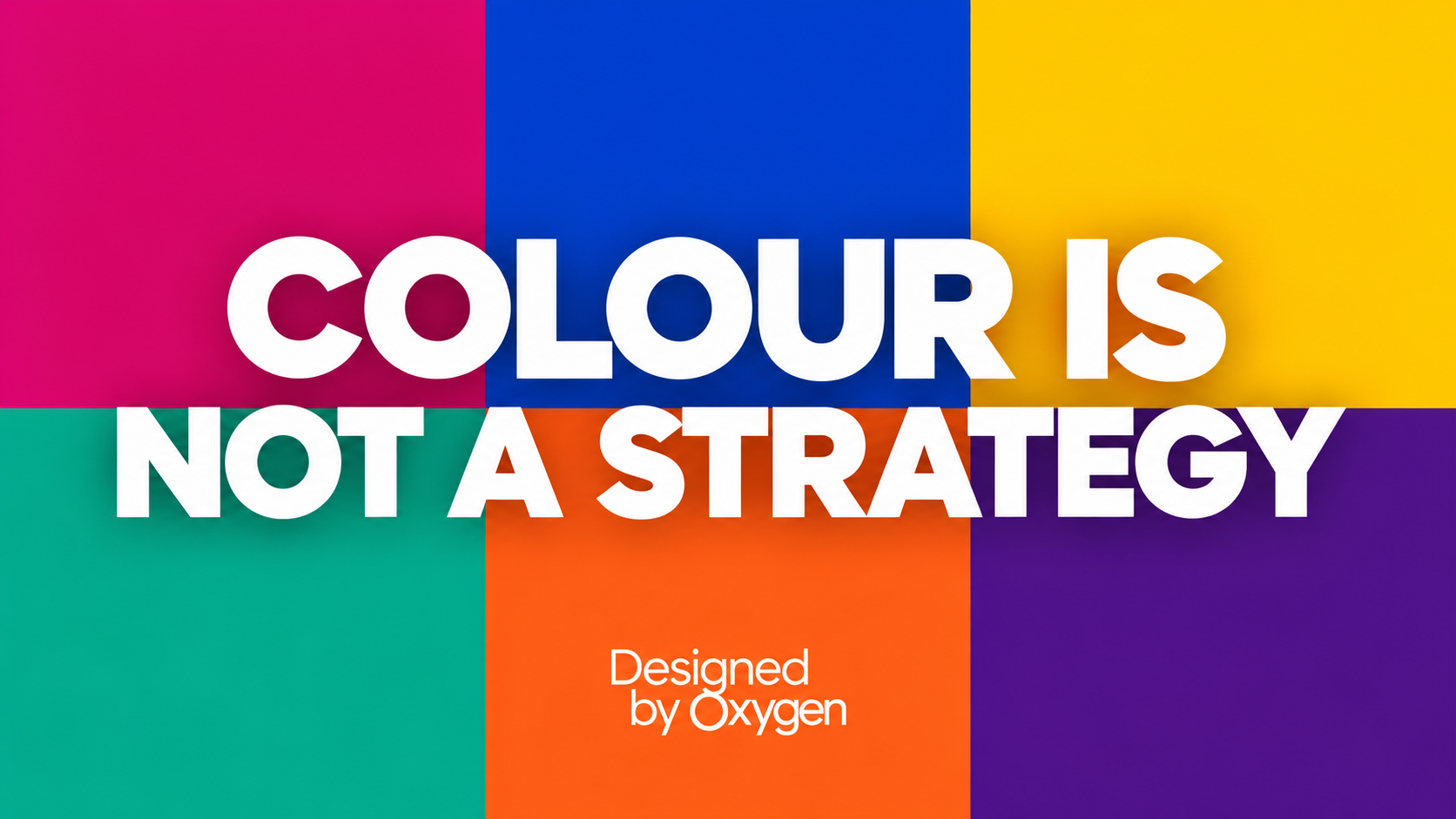
Colour Is Not a Strategy Poster
Related Company: Oxygen Communications Ltd

Brand Colour: A Personal Preference or a Strategic Decision?

15th Oct 2026
We all have colours we love. Unfortunately, that’s not a brand strategy.

Colour is one of the most immediate and powerful elements of a brand’s identity. Before a potential customer has read a word, explored a website or understood what a business offers, colour has already started to shape their perception.

But as B4 Member Designed by Oxygen points out, choosing the right colours for your brand involves considerably more than selecting a palette that looks attractive.

Beyond the Colour Stereotypes

We’ve all heard the familiar associations. Blue represents trust, green suggests sustainability and yellow communicates optimism. But branding isn’t quite that straightforward.

A blue logo doesn’t automatically make a business trustworthy, any more than a green one demonstrates genuine environmental credentials.

Context is everything.

The most effective brand colours are chosen with a clear understanding of the market, the audience and the personality a business wants to communicate.

What colours are competitors using? What associations might customers already have? Does the chosen palette help the brand stand out, or simply blend into an increasingly crowded marketplace?

Sometimes the strongest choice is one that challenges expectations rather than follows them.

Making Colour Work Harder

There are also important practical considerations. A successful brand palette needs to work consistently across websites, social media, presentations, printed materials and everything in between.

Designed by Oxygen encourages businesses to consider whether their colours provide sufficient contrast, offer flexibility across different applications and establish a clear visual hierarchy.

Which colours should dominate? Which should support? And can everyone responsible for communicating the brand use them confidently and consistently?

These might seem like small details, but collectively they contribute to a recognisable, professional and effective identity.

The Question Every Business Should Ask

Designed by Oxygen suggests a simple but revealing test:

“If we changed this colour, what would we lose?”

If the answer is “nothing really”, there’s a good chance that colour isn’t doing much strategic work.

A carefully considered palette should communicate something meaningful about a business, reinforce its positioning and contribute to how customers recognise and remember it.

Ultimately, great branding isn’t about choosing colours you like. It’s about choosing colours that work.

And that’s a distinction worth remembering the next time you’re reviewing your brand identity.

Back to news

Brand Colour: A Personal Preference or a Strategic Decision?

15th Oct 2026
Colour Is Not a Strategy Poster
Related Company: Oxygen Communications Ltd
We all have colours we love. Unfortunately, that’s not a brand strategy.

Colour is one of the most immediate and powerful elements of a brand’s identity. Before a potential customer has read a word, explored a website or understood what a business offers, colour has already started to shape their perception.

But as B4 Member Designed by Oxygen points out, choosing the right colours for your brand involves considerably more than selecting a palette that looks attractive.

Beyond the Colour Stereotypes

We’ve all heard the familiar associations. Blue represents trust, green suggests sustainability and yellow communicates optimism. But branding isn’t quite that straightforward.

A blue logo doesn’t automatically make a business trustworthy, any more than a green one demonstrates genuine environmental credentials.

Context is everything.

The most effective brand colours are chosen with a clear understanding of the market, the audience and the personality a business wants to communicate.

What colours are competitors using? What associations might customers already have? Does the chosen palette help the brand stand out, or simply blend into an increasingly crowded marketplace?

Sometimes the strongest choice is one that challenges expectations rather than follows them.

Making Colour Work Harder

There are also important practical considerations. A successful brand palette needs to work consistently across websites, social media, presentations, printed materials and everything in between.

Designed by Oxygen encourages businesses to consider whether their colours provide sufficient contrast, offer flexibility across different applications and establish a clear visual hierarchy.

Which colours should dominate? Which should support? And can everyone responsible for communicating the brand use them confidently and consistently?

These might seem like small details, but collectively they contribute to a recognisable, professional and effective identity.

The Question Every Business Should Ask

Designed by Oxygen suggests a simple but revealing test:

“If we changed this colour, what would we lose?”

If the answer is “nothing really”, there’s a good chance that colour isn’t doing much strategic work.

A carefully considered palette should communicate something meaningful about a business, reinforce its positioning and contribute to how customers recognise and remember it.

Ultimately, great branding isn’t about choosing colours you like. It’s about choosing colours that work.

And that’s a distinction worth remembering the next time you’re reviewing your brand identity.

Back to news