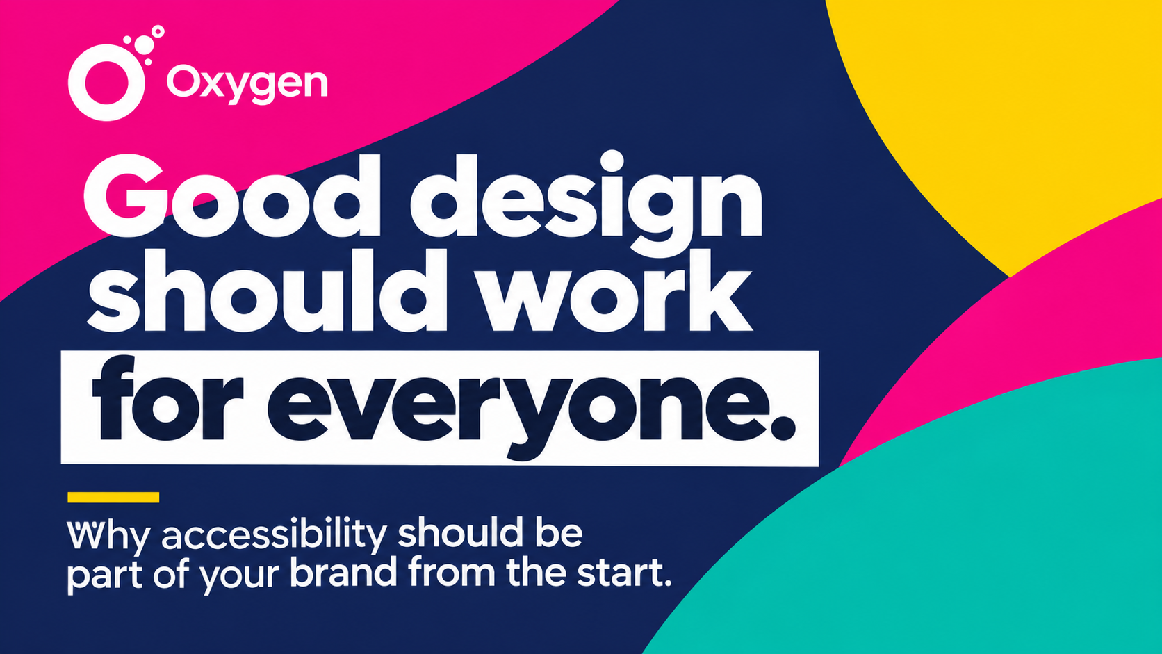
Beautiful design is only effective if people can actually read, understand and engage with it. Oxfordshire creative agency Oxygen highlights why accessibility should be built into every brand from the outset.
Businesses invest considerable time, energy and money in developing their visual identities. From logos and colour palettes to websites, presentations and marketing materials, every design decision helps shape how an organisation communicates.
But there’s a fundamental question that can sometimes get overlooked:
What happens if someone can’t read what you’ve created?
As our friends at Oxygen point out, beautiful design that someone cannot read simply isn’t doing its job.
And it’s a message that every business, regardless of size or sector, should take seriously.
Accessibility Starts with the Design Process
Accessibility shouldn’t be something businesses consider only once their branding is complete or their website is ready to launch.
It should influence the decisions being made throughout the creative process.
The colours selected, the fonts used, the size of the text and the way information is presented all affect how easily people can engage with a brand.
Oxygen highlights four particularly important considerations:
- Colour contrast: Is there sufficient contrast between text and background colours to make information easy to read?
- Typography: Are font sizes comfortable to read, particularly on smaller screens?
- Legibility: Are the typefaces and layouts clear, rather than simply visually appealing?
- Colour independence: Can people understand the information without relying on colour alone?
These may sound like relatively small details, but collectively they can make an enormous difference to the experience of customers, employees and other audiences.
Accessibility Doesn’t Mean Sacrificing Creativity
One of the misconceptions about accessible design is that it somehow restricts creativity or forces businesses to compromise their visual identity.
Oxygen challenges that assumption.
Designing accessibly doesn’t mean stripping the personality out of a brand. It means being more intentional about how that personality is expressed.
A distinctive visual identity can still be bold, colourful, imaginative and memorable while remaining clear and accessible.
In fact, thinking carefully about accessibility can encourage more thoughtful design decisions.
The objective isn’t simply to create something that looks impressive.
It’s to create something that communicates effectively.
Start with Your Brand Guidelines
For businesses wondering where to begin, Oxygen recommends reviewing the colour combinations and typography used most frequently across their brand.
Consider how those elements perform in everyday situations.
Does white text remain readable against your chosen background colour? How might someone with colour vision deficiency experience your designs? Is the smallest text on your website genuinely comfortable to read?
These are questions worth answering before brand guidelines are rolled out across websites, social media, brochures and other communications.
As Oxygen observes, finding an accessibility problem in your brand guidelines is considerably easier than discovering the same problem across 200 live web pages.
Addressing these issues early can save time, reduce unnecessary redesign work and improve consistency.
Accessibility Is Everyone’s Responsibility
Although accessibility is often discussed in the context of graphic design and web development, its importance extends far beyond creative teams.
Marketing professionals, business owners, communications teams and anyone producing content under an organisation’s brand have a part to play.
Whether preparing a presentation, publishing a LinkedIn graphic, creating an event invitation or updating a website, the same basic principles apply.
Is the information clear? Can people read it comfortably? Does the design help communicate the message, or does it get in the way?
Making accessibility part of everyday business communications is a shared responsibility.
Good Design Isn’t Just About Appearance
For businesses looking to strengthen their brands, Oxygen’s message provides a useful reminder that successful design is about much more than aesthetics.
A visual identity should be recognisable, consistent and engaging.
But above all, it should work for the people it’s intended to reach.
By building accessibility into the design process, businesses can create communications that are not only more inclusive but also clearer and more effective.
Because good design isn’t just about how something looks. It’s about whether it works.
About Oxygen
Oxygen is a creative agency helping organisations develop their brands and communicate more effectively through thoughtful design.
Their latest insight encourages businesses to review the accessibility of their visual identities and ensure that good design works for everyone.
Find out more: www.designedbyoxygen.com